
Editor’s note: This article by Crystal Wang was originally published on her personal blog, and has been re-posted here with permission.
As a Chinese American, I have always been sensitive to how Chinese culture is represented in the United States. When I joined the design community, one of the things that I became very aware of was the importance of typeface and branding. With this new lens of design, I began to explore how Chinese culture is portrayed in typography and iconography in the United States.
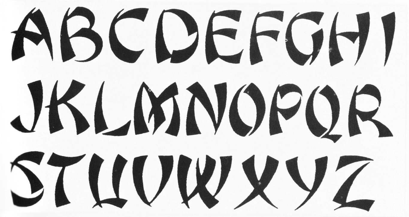
For most Americans, the typeface above is considered “Chinese.” Found in front of Chinese restaurants all over the United States, it is an attempt to emulate the strokes of Chinese calligraphy. However, showing this font to a native Chinese person usually results in total confusion and disbelief.
Today this font is typically perceived as backwards and racist — but even still, it is extremely recognizable. I have always wondered, who or what started this association?
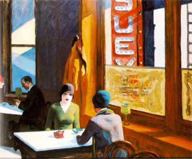
Chop Suey, Edward Hopper (1929)
The History of Chop Suey
Chop suey became a popular Chinese dish in the United States in the 19th century. The origin of the dish is unclear, but it seems to stem back to the word zasui (杂碎), which roughly translates into “leftovers.” This dish originated in the Guangdong province of China, where most of the early Chinese immigrants came from. There are many speculations about the original creator of chop suey, but one thing is clear — it has become an entirely American invention, and is almost not recognizable in China.
So why did chop suey and the Chinese restaurant become so ubiquitous and popular? Unfortunately, this was actually due to the heavy restrictions that were placed on Chinese immigrants during the 19th century. Anti-Chinese legislation prevented Chinese immigrants from pursuing other types of employment. Because of their limited options, they turned to opening restaurants to support their livelihoods.
Although the chop suey font was not aesthetically pleasing or accurate, it was an excellent business tactic — it helped Americans to easily recognize and identify Chinese restaurants.
Surprisingly, this font and chop suey were actually encouraged by Chinese restaurant owners. Although the font was not aesthetically pleasing or accurate, it was an excellent business tactic — it helped Americans to easily recognize and identify Chinese restaurants and actually acted as a typographical signaling beacon.

Chop Suey Typeface Today
Recently, FreshDirect, a popular grocery delivery company, came under fire for creating an advertisement with the chop suey font.
According to the Wall Street Journal article, “Is Your Font Racist?” the film editor Jennifer Lee* reached out to the PR team at Freshdirect, only to get a canned, polite non-response.
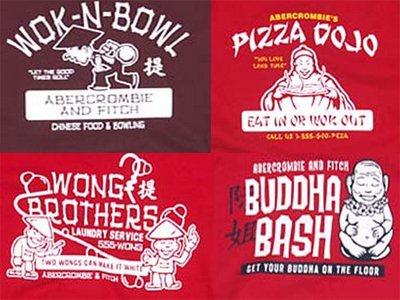
Abercrombie & Fitch t-shirts
Abercrombie and Fitch also had to pull a few t-shirt designs after these types of “Asian fonts” were paired with asian caricatures on some of their merchandise.
Although today, this font does not indicate authenticity, I can’t help but wonder: how does this seemingly benign font affect people and their perceptions?

The Chinese Takeout Box
“Chinese” design has also found its way into iconography. A recent emoji that was designed to depict a Chinese takeout box has also recently come under fire. The takeout box has becoming synonymous with Chinese food in the US, although the box is an American invention. However, what was problematic about these emojis is not the box itself, but the chopsticks sticking out of them.
In Chinese culture, sticking chopsticks straight up in rice is considered an extremely bad omen, as it is reminiscent of incense sticks. This is something meant to pay tribute to the dead, and is considered very unlucky.
It is interesting to note that the designer of this emoji is a Chinese-American herself. Is it misappropriation and offensive design if the creator is themselves of Chinese descent? Does their heritage give them more legitimacy? The chop suey font was originally perpetuated by Chinese restauranteurs — though not accurate, was there more legitimacy because they were used and spread by Chinese people themselves?

Justin Bieber’s tattoo mishap
Chinese Tattoos
Another interesting appropriation of Chinese typography is the prevalence of tattoos with Chinese characters. In the above picture, we see Justin Bieber’s short lived Chinese tattoo. Although cóngxīn (从心) can be interpreted as “follow your heart,” when the characters are placed on top of each other, it actually is a different word all together. It says sǒng (怂), which is actually a mild derogatory expletive.
It’s akin to putting a tattoo in English on someone’s arm entirely in Comic Sans, but possibly worse.
Although the text itself is often translated incorrectly, much to the amusement of native Chinese speakers, a larger disconnect between these tattoos and Chinese calligraphy is the quality of the typography. Chinese culture places a great emphasis on good handwriting and calligraphy, and it’s a huge issue when these Chinese characters are not tattooed properly. It is akin to putting a tattoo in English on someone’s arm entirely in Comic Sans, but possibly worse.
Consequences
Although I’m not clear about what the actual consequences of this typography and iconography are, what I can be certain of is that this has essentially created a whole new identity for the Chinese in the US.
This type of representation puts a label on Chinese culture that I’m not sure I’m personally comfortable with. Although there is no direct correlation between poor font choice and Asian hate crimes, I do think that when we design for a country as diverse as ours, it’s important to be extremely thoughtful and careful about our choices in how to represent certain cultures. Cultural misappropriation and stereotyping a culture can be an extremely slippery slope, especially in the political climate we live in today.
My plea to designers out there would be to choose thoughtfully and contextually — don’t oversimplify an entire culture.
An earlier version of this article stated that “popular New York Times journalist Jennifer 8. Lee” reached out to Freshdirect about their font; it was actually film editor Jennifer Lee.