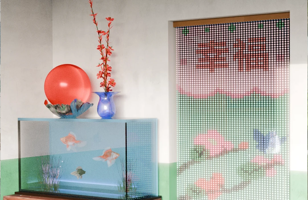
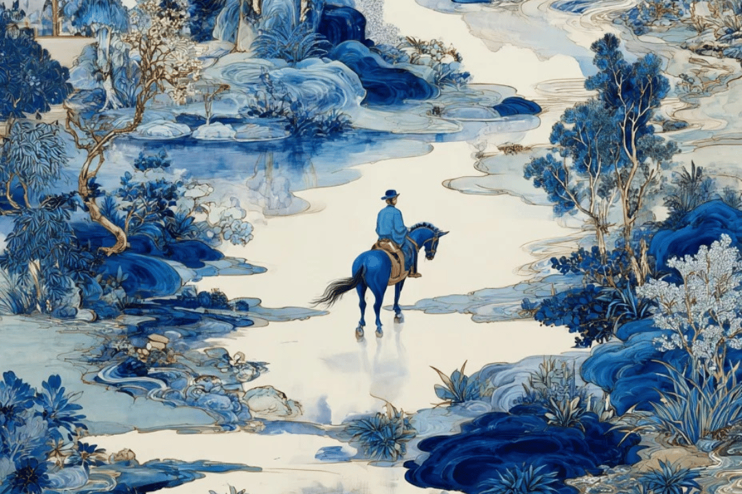
Feature image of China Beyond Cliché: The Candid, Heartfelt Illustrations of Xinmei Liu

China Beyond Cliché: The Candid, Heartfelt Illustrations of Xinmei Liu

6 mins read

6 mins read

Feature image of China Beyond Cliché: The Candid, Heartfelt Illustrations of Xinmei Liu
With a tone of reflective nostalgia, Liu’s illustrations show the peculiarities of life in China

When the staff at The New York Times, The New Yorker, and Amazon Publishing request a China-related graphic illustration nowadays, they often reach out to Xinmei Liu, aka Cat Mover or, in Chinese, Nuo Mao Zhe (挪猫者).

“I guess art directors put me in a folder labeled ‘Asian’ or ‘Chinese’ because they always come to me when they need visuals for such themes,” Liu jokes.

Born in Shanghai and based in New York City, Liu’s work indeed has a broader scope. Still, in the directors’ defense, her love for Chinese culture really comes through in her illustrations, making them stand out from the typical, outdated pictures often seen in international outlets.
Xinmei Liu

Cityscapes

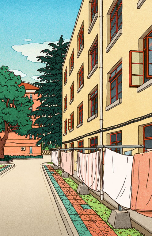
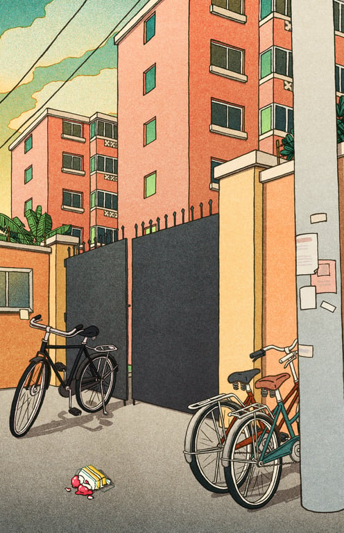
With a tone of reflective nostalgia, most apparent in her use of warm colors and grainy texture, Liu’s illustrations show the peculiarities of life in the country.

Her work is endearing on a global level, but it touches a Chinese audience with particular intimacy — especially those from the post-1990 generation.
Xinmei Liu

Cityscapes

Liu remembers her childhood in Shanghai in a very sensorial way. She recalls the acrid smell of the chemicals in the old lab building of the East China University of Science and Technology, where her father worked as a chemistry professor and where she would sometimes be taken care of by his grad students.

She remembers the made-up chants her grandfather sang in his native dialect during long strolls around the neighborhood, and the sour taste of the grapes from the vine he planted in the garden — they had to eat them unripe to beat the birds and ants.

Illustrations of Cityscape from my Childhood Memories

Cityscapes

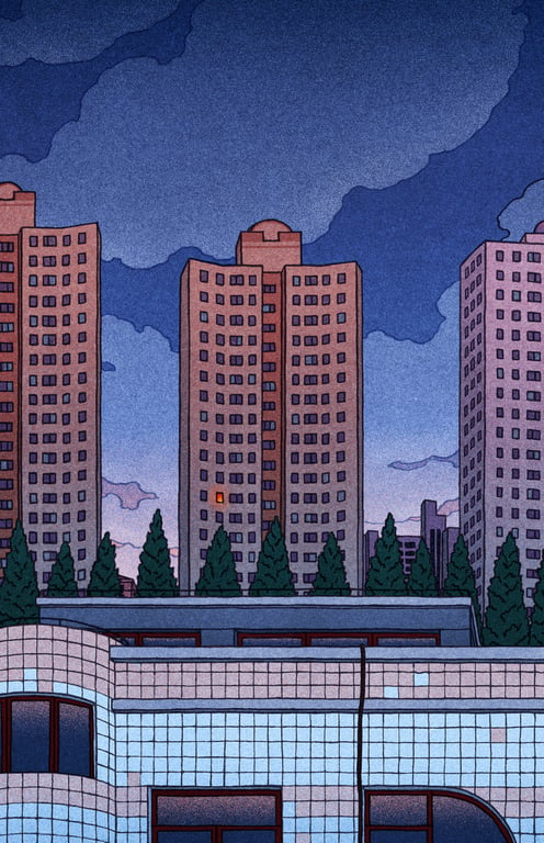
Years later, Liu’s memories resulted in Cityscapes, a series of illustrations based on her recollections of the world around her as she grew up. The series depicts views throughout Shanghai, including old-fashioned bikes, clothes hanging to dry, urban compounds, and the dark metal windows typical of the city’s modernist buildings.
Xinmei Liu

Cityscapes

It was only after moving to New York City to pursue her MFA in illustration as visual essay from the School of Visual Arts that Liu realized her Western peers seemed to have had a more carefree childhood than her — at least when it came to certain kinds of pressure.
Xinmei Liu

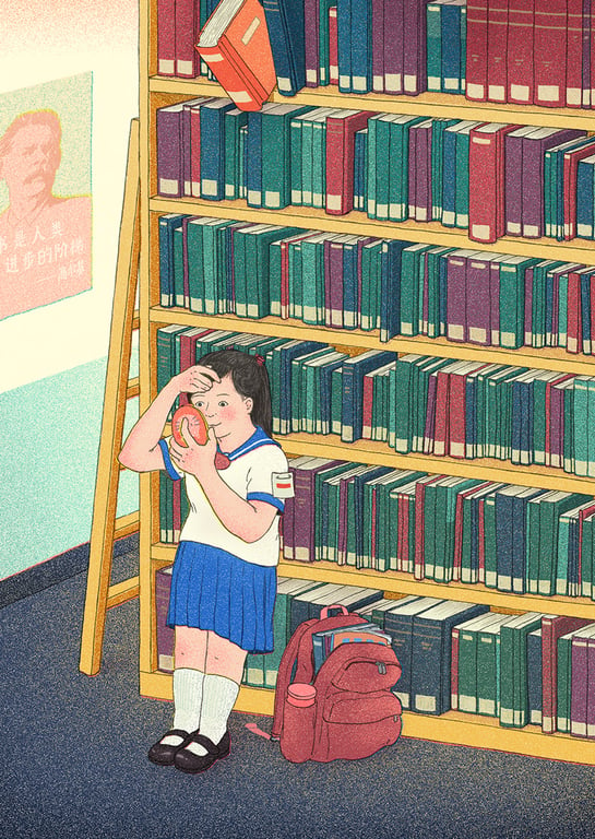
Model Citizen Guidelines: “Focus on Your Books Not Your Looks”

Her series Model Citizen Guidelines depicts several maxims kids had to live by, such as being a team player, focusing on books (as opposed to looks), and, essentially, being good at everything. However, Liu depicts the theme with irony, conveying how kids relate to such rules with delightful cheekiness.
Xinmei Liu

Model Citizen Guidelines: “Always Be Contributing”

“I can’t help being a little ironic or satirical in my art since these are the thoughts that I don’t usually feel comfortable expressing verbally. Sometimes humor is more effective in evoking thoughts and reflections and is also an excellent way to talk about taboos,” she says.

Xinmei Liu

Model Citizen Guidelines: “Suffering is Good for You”

Although the series is primarily based on her own experience, Liu intends to challenge conventional ideas on how kids should behave in ways that are not specific to Chinese culture, but rather universal.
Xinmei Liu

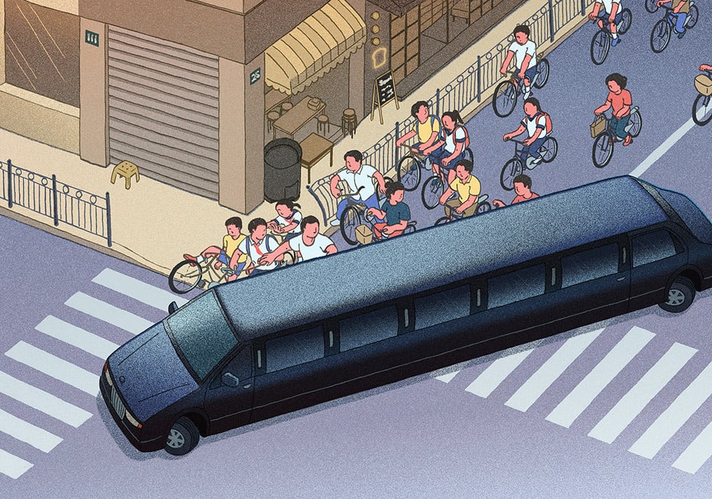
Model Citizen Guidelines: “Rich People Are Not Your Friends”

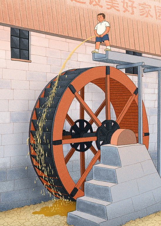
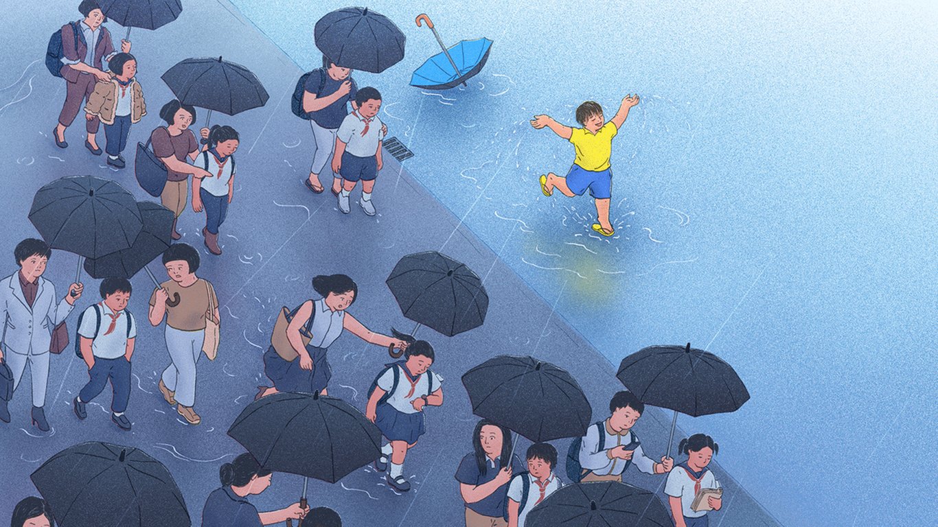
In most drawings for this series, there’s an outlier. We see a kid who doesn’t follow the rules, who plays in the rain, pees on the mill, or prefers art to science.
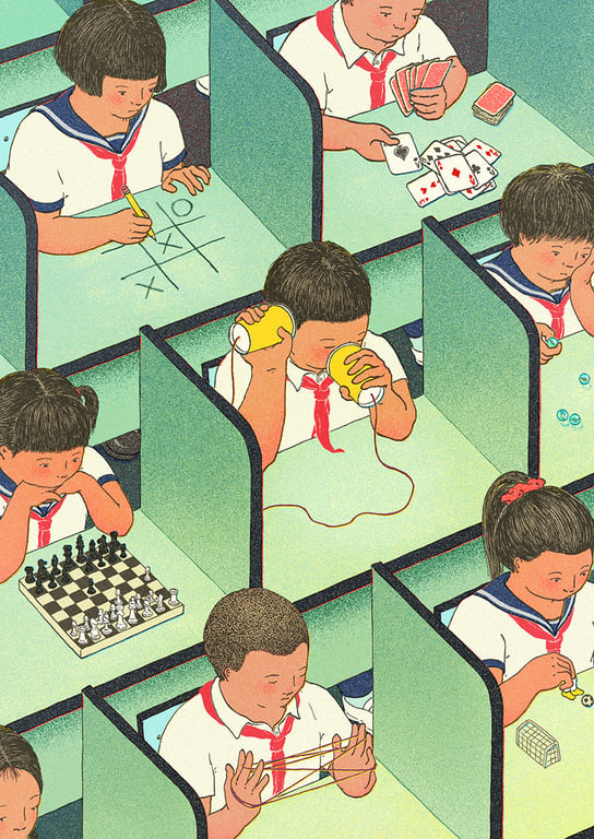
Xinmei Liu

Model Citizen Guidelines: “Mind Your Own Business”

This kid may very well represent Liu’s inner rebel when she was a child. “I was terrified of getting into trouble and constantly felt the need to fulfill expectations from adults and from anyone who saw me as a model of a good kid. I was a rebel at heart, but not in action,” she says.
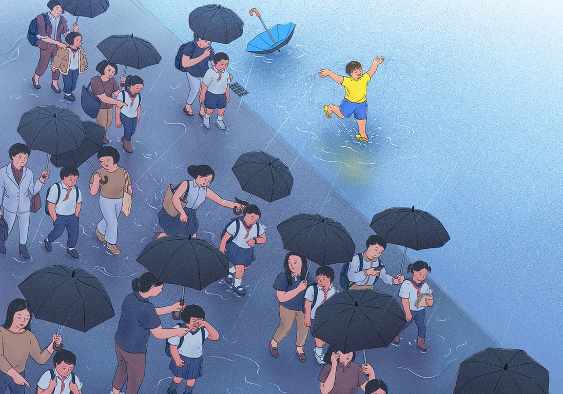
Xinmei Liu

Model Citizen Guidelines: “Kids Without a Mom is Like a Rainy Day”

Studying art made Liu tweak her perspective towards the little things from her childhood, such as the packaging design of iconic Chinese products.

“The White Rabbit candy wrapper is a classic, and there’s also the milk-glass jar of the ‘Friendship’ face cream with its green cap; I like its simple-but-elegant shape and the unassuming geometric label,” she says.

Even though these products rarely appear in her illustrations, their Art Deco aesthetics have definitely made their way into her style.
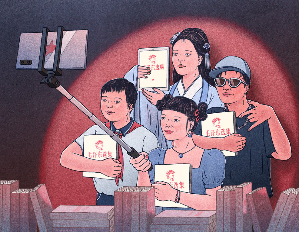
Xinmei Liu

For The New York Times “New New World” column

Chinese propaganda posters also influenced her work — not the ones from the 2000s when she grew up, but the vintage ones from the 1980s.

She’s drawn to their graphic style, type-design, and use of negative space, all elements she incorporates into her illustrations, combined with more modern motifs that reflect Chinese society today.

The combination of retro and modern elements is clear on her cover for The Shanghairen, an initiative that pays tribute to Shanghai by inviting artists to draw their favorite scenes in the city.

Liu’s cover shows two funky senior ladies boasting retro wear and Apple gadgets and holding ​​eye-catching dance fans at People’s Park.
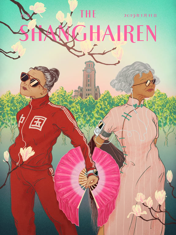
Xunmei Liu

The Shanghairen

“I think the way old people live in Shanghai really shows the city’s culture and energy. They’re actually at the famous blind date corner, where uncles and aunties look for partners for their unmarried children,” Liu says.

“I read some aunties were setting up blind dates there for their gay children too,” she adds.

Liu’s most recent cover work was for the first English translation of Liu Xinwu’s The Wedding Party. The ​​novel is set on a single day in 1982, in a Beijing siheyuan (courtyard) house, and is replete with quirky characters.
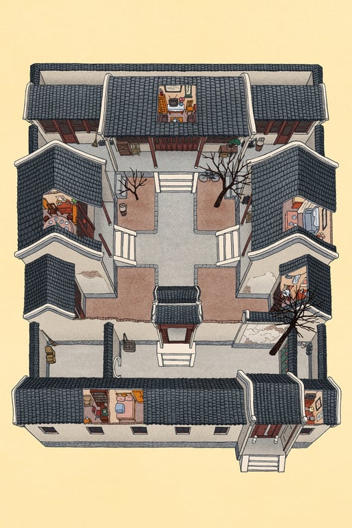
Xinmei Liu

Interior illustration of the siheyuan for The Wedding Party

She developed a few different ideas for the cover. Some focused on the wedding party and the banquet; others explored the architectural side of the novel, since the original Chinese title translates literally to “Bell and Drum Tower.”

The chosen design depicts the diverse set of characters gathered in front of the siheyuan, and Liu hopes readers will have fun identifying who’s who in the story.
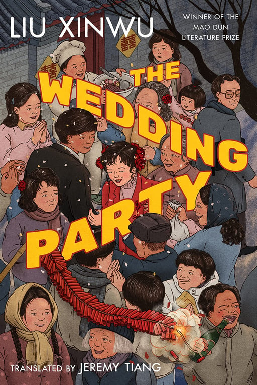
Xinmei Liu

Cover art for Liu Xinwu’s novel The Wedding Party

For the project, she had to do in-depth research on the history and structure of siheyuans, and on culinary traditions, like the dishes prepared for wedding occasions.

“The story itself is an excellent reference. It taught me a lot about Beijing in the 1980s,” she says, adding that Xinwu also describes the banquet in detail, citing the order the dishes are served.
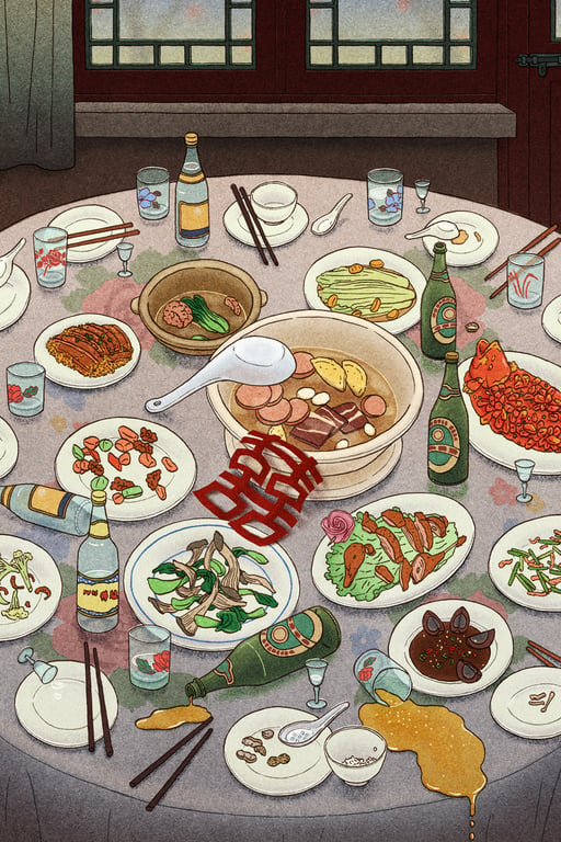
Liu Xunmei

“The Banquet Table” — interior illustration for The Wedding Party

The book also includes two internal illustrations by Liu: an aerial view of the courtyard house showing the different rooms where the story takes place, and a drawing of a messy banquet table after the feast, with the food leftovers and Tsingtao beer spilled all over the floral tablecloth.

Interestingly, Liu has only been to Beijing on quick trips. “Now, I really want to go back and explore the hutongs,” she says, referring to the small alleys surrounded by traditional courtyards commonly found in Beijing.

Xinmei Liu

The above image was used for The New York Times’ review of the novel Joan is Okay by Weike Wang

Liu’s most frequent illustrations are editorial assignments for articles and book reviews. Given the climate of international geopolitics, most projects are critical of China, and the occasional political piece might land in her hands.
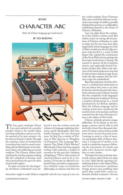
Xinmei Liu

For a New Yorker book review of Kingdom of Character: the Language Revolution That Made China Modern by Jing Tsu

Stuck in between worlds, Liu feels she has no responsibility or even power to relieve the tension with her work. However, she stands firm in always making sure she agrees with the content before taking on an assignment.

That’s not to say that her work is not critical of her country — it often is. But the last thing she wants is for it to serve as propaganda for any side.
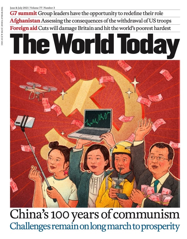
Xinmei Liu

For the cover of the June-July 2021 issue of The World Today Magazine

Through her illustrations, Liu provides a candid, original, and revealing look into a complex and ever-evolving country that she knows from the inside out — one that’s impossible to summarize with clichés.

“I don’t think you need a red background with yellow stars to symbolize China. I know that drawing such imagery would be quite boring for me,” says Liu.

“Instead, I enjoy drawing actual people and life in China a lot more, because I can relate to them.”

All images courtesy of Xinmei Liu

Additional reporting by Lucas Tinoco

NEWSLETTER

Get weekly top picks and exclusive, newsletter only content delivered straight to you inbox.

NEWSLETTER

Get weekly top picks and exclusive, newsletter only content delivered straight to you inbox.

RADII NEWSLETTER

Get weekly top picks and exclusive, newsletter only content delivered straight to you inbox

Feature image of China Beyond Cliché: The Candid, Heartfelt Illustrations of Xinmei Liu

China Beyond Cliché: The Candid, Heartfelt Illustrations of Xinmei Liu

6 mins read

With a tone of reflective nostalgia, Liu’s illustrations show the peculiarities of life in China

When the staff at The New York Times, The New Yorker, and Amazon Publishing request a China-related graphic illustration nowadays, they often reach out to Xinmei Liu, aka Cat Mover or, in Chinese, Nuo Mao Zhe (挪猫者).

“I guess art directors put me in a folder labeled ‘Asian’ or ‘Chinese’ because they always come to me when they need visuals for such themes,” Liu jokes.

Born in Shanghai and based in New York City, Liu’s work indeed has a broader scope. Still, in the directors’ defense, her love for Chinese culture really comes through in her illustrations, making them stand out from the typical, outdated pictures often seen in international outlets.

Xinmei Liu

Cityscapes

With a tone of reflective nostalgia, most apparent in her use of warm colors and grainy texture, Liu’s illustrations show the peculiarities of life in the country.

Her work is endearing on a global level, but it touches a Chinese audience with particular intimacy — especially those from the post-1990 generation.

Xinmei Liu

Cityscapes

Liu remembers her childhood in Shanghai in a very sensorial way. She recalls the acrid smell of the chemicals in the old lab building of the East China University of Science and Technology, where her father worked as a chemistry professor and where she would sometimes be taken care of by his grad students.

She remembers the made-up chants her grandfather sang in his native dialect during long strolls around the neighborhood, and the sour taste of the grapes from the vine he planted in the garden — they had to eat them unripe to beat the birds and ants.

Illustrations of Cityscape from my Childhood Memories

Cityscapes

Years later, Liu’s memories resulted in Cityscapes, a series of illustrations based on her recollections of the world around her as she grew up. The series depicts views throughout Shanghai, including old-fashioned bikes, clothes hanging to dry, urban compounds, and the dark metal windows typical of the city’s modernist buildings.

Xinmei Liu

Cityscapes

It was only after moving to New York City to pursue her MFA in illustration as visual essay from the School of Visual Arts that Liu realized her Western peers seemed to have had a more carefree childhood than her — at least when it came to certain kinds of pressure.

Xinmei Liu

Model Citizen Guidelines: “Focus on Your Books Not Your Looks”

Her series Model Citizen Guidelines depicts several maxims kids had to live by, such as being a team player, focusing on books (as opposed to looks), and, essentially, being good at everything. However, Liu depicts the theme with irony, conveying how kids relate to such rules with delightful cheekiness.

Xinmei Liu

Model Citizen Guidelines: “Always Be Contributing”

“I can’t help being a little ironic or satirical in my art since these are the thoughts that I don’t usually feel comfortable expressing verbally. Sometimes humor is more effective in evoking thoughts and reflections and is also an excellent way to talk about taboos,” she says.

Xinmei Liu

Model Citizen Guidelines: “Suffering is Good for You”

Although the series is primarily based on her own experience, Liu intends to challenge conventional ideas on how kids should behave in ways that are not specific to Chinese culture, but rather universal.

Xinmei Liu

Model Citizen Guidelines: “Rich People Are Not Your Friends”

In most drawings for this series, there’s an outlier. We see a kid who doesn’t follow the rules, who plays in the rain, pees on the mill, or prefers art to science.

Xinmei Liu

Model Citizen Guidelines: “Mind Your Own Business”

This kid may very well represent Liu’s inner rebel when she was a child. “I was terrified of getting into trouble and constantly felt the need to fulfill expectations from adults and from anyone who saw me as a model of a good kid. I was a rebel at heart, but not in action,” she says.

Xinmei Liu

Model Citizen Guidelines: “Kids Without a Mom is Like a Rainy Day”

Studying art made Liu tweak her perspective towards the little things from her childhood, such as the packaging design of iconic Chinese products.

“The White Rabbit candy wrapper is a classic, and there’s also the milk-glass jar of the ‘Friendship’ face cream with its green cap; I like its simple-but-elegant shape and the unassuming geometric label,” she says.

Even though these products rarely appear in her illustrations, their Art Deco aesthetics have definitely made their way into her style.

Xinmei Liu

For The New York Times “New New World” column

Chinese propaganda posters also influenced her work — not the ones from the 2000s when she grew up, but the vintage ones from the 1980s.

She’s drawn to their graphic style, type-design, and use of negative space, all elements she incorporates into her illustrations, combined with more modern motifs that reflect Chinese society today.

The combination of retro and modern elements is clear on her cover for The Shanghairen, an initiative that pays tribute to Shanghai by inviting artists to draw their favorite scenes in the city.

Liu’s cover shows two funky senior ladies boasting retro wear and Apple gadgets and holding ​​eye-catching dance fans at People’s Park.

Xunmei Liu

The Shanghairen

“I think the way old people live in Shanghai really shows the city’s culture and energy. They’re actually at the famous blind date corner, where uncles and aunties look for partners for their unmarried children,” Liu says.

“I read some aunties were setting up blind dates there for their gay children too,” she adds.

Liu’s most recent cover work was for the first English translation of Liu Xinwu’s The Wedding Party. The ​​novel is set on a single day in 1982, in a Beijing siheyuan (courtyard) house, and is replete with quirky characters.

Xinmei Liu

Interior illustration of the siheyuan for The Wedding Party

She developed a few different ideas for the cover. Some focused on the wedding party and the banquet; others explored the architectural side of the novel, since the original Chinese title translates literally to “Bell and Drum Tower.”

The chosen design depicts the diverse set of characters gathered in front of the siheyuan, and Liu hopes readers will have fun identifying who’s who in the story.

Xinmei Liu

Cover art for Liu Xinwu’s novel The Wedding Party

For the project, she had to do in-depth research on the history and structure of siheyuans, and on culinary traditions, like the dishes prepared for wedding occasions.

“The story itself is an excellent reference. It taught me a lot about Beijing in the 1980s,” she says, adding that Xinwu also describes the banquet in detail, citing the order the dishes are served.

Liu Xunmei

“The Banquet Table” — interior illustration for The Wedding Party

The book also includes two internal illustrations by Liu: an aerial view of the courtyard house showing the different rooms where the story takes place, and a drawing of a messy banquet table after the feast, with the food leftovers and Tsingtao beer spilled all over the floral tablecloth.

Interestingly, Liu has only been to Beijing on quick trips. “Now, I really want to go back and explore the hutongs,” she says, referring to the small alleys surrounded by traditional courtyards commonly found in Beijing.

Xinmei Liu

The above image was used for The New York Times’ review of the novel Joan is Okay by Weike Wang

Liu’s most frequent illustrations are editorial assignments for articles and book reviews. Given the climate of international geopolitics, most projects are critical of China, and the occasional political piece might land in her hands.

Xinmei Liu

For a New Yorker book review of Kingdom of Character: the Language Revolution That Made China Modern by Jing Tsu

Stuck in between worlds, Liu feels she has no responsibility or even power to relieve the tension with her work. However, she stands firm in always making sure she agrees with the content before taking on an assignment.

That’s not to say that her work is not critical of her country — it often is. But the last thing she wants is for it to serve as propaganda for any side.

Xinmei Liu

For the cover of the June-July 2021 issue of The World Today Magazine

Through her illustrations, Liu provides a candid, original, and revealing look into a complex and ever-evolving country that she knows from the inside out — one that’s impossible to summarize with clichés.

“I don’t think you need a red background with yellow stars to symbolize China. I know that drawing such imagery would be quite boring for me,” says Liu.

“Instead, I enjoy drawing actual people and life in China a lot more, because I can relate to them.”

All images courtesy of Xinmei Liu

Additional reporting by Lucas Tinoco
NEWSLETTER

Get weekly top picks and exclusive, newsletter only content delivered straight to you inbox.

RADII NEWSLETTER

Get weekly top picks and exclusive, newsletter only content delivered straight to you inbox

RELATED POSTS

Feature image of China Beyond Cliché: The Candid, Heartfelt Illustrations of Xinmei Liu

China Beyond Cliché: The Candid, Heartfelt Illustrations of Xinmei Liu

6 mins read

6 mins read

Feature image of China Beyond Cliché: The Candid, Heartfelt Illustrations of Xinmei Liu
With a tone of reflective nostalgia, Liu’s illustrations show the peculiarities of life in China

When the staff at The New York Times, The New Yorker, and Amazon Publishing request a China-related graphic illustration nowadays, they often reach out to Xinmei Liu, aka Cat Mover or, in Chinese, Nuo Mao Zhe (挪猫者).

“I guess art directors put me in a folder labeled ‘Asian’ or ‘Chinese’ because they always come to me when they need visuals for such themes,” Liu jokes.

Born in Shanghai and based in New York City, Liu’s work indeed has a broader scope. Still, in the directors’ defense, her love for Chinese culture really comes through in her illustrations, making them stand out from the typical, outdated pictures often seen in international outlets.

Xinmei Liu

Cityscapes

With a tone of reflective nostalgia, most apparent in her use of warm colors and grainy texture, Liu’s illustrations show the peculiarities of life in the country.

Her work is endearing on a global level, but it touches a Chinese audience with particular intimacy — especially those from the post-1990 generation.

Xinmei Liu

Cityscapes

Liu remembers her childhood in Shanghai in a very sensorial way. She recalls the acrid smell of the chemicals in the old lab building of the East China University of Science and Technology, where her father worked as a chemistry professor and where she would sometimes be taken care of by his grad students.

She remembers the made-up chants her grandfather sang in his native dialect during long strolls around the neighborhood, and the sour taste of the grapes from the vine he planted in the garden — they had to eat them unripe to beat the birds and ants.

Illustrations of Cityscape from my Childhood Memories

Cityscapes

Years later, Liu’s memories resulted in Cityscapes, a series of illustrations based on her recollections of the world around her as she grew up. The series depicts views throughout Shanghai, including old-fashioned bikes, clothes hanging to dry, urban compounds, and the dark metal windows typical of the city’s modernist buildings.

Xinmei Liu

Cityscapes

It was only after moving to New York City to pursue her MFA in illustration as visual essay from the School of Visual Arts that Liu realized her Western peers seemed to have had a more carefree childhood than her — at least when it came to certain kinds of pressure.

Xinmei Liu

Model Citizen Guidelines: “Focus on Your Books Not Your Looks”

Her series Model Citizen Guidelines depicts several maxims kids had to live by, such as being a team player, focusing on books (as opposed to looks), and, essentially, being good at everything. However, Liu depicts the theme with irony, conveying how kids relate to such rules with delightful cheekiness.

Xinmei Liu

Model Citizen Guidelines: “Always Be Contributing”

“I can’t help being a little ironic or satirical in my art since these are the thoughts that I don’t usually feel comfortable expressing verbally. Sometimes humor is more effective in evoking thoughts and reflections and is also an excellent way to talk about taboos,” she says.

Xinmei Liu

Model Citizen Guidelines: “Suffering is Good for You”

Although the series is primarily based on her own experience, Liu intends to challenge conventional ideas on how kids should behave in ways that are not specific to Chinese culture, but rather universal.

Xinmei Liu

Model Citizen Guidelines: “Rich People Are Not Your Friends”

In most drawings for this series, there’s an outlier. We see a kid who doesn’t follow the rules, who plays in the rain, pees on the mill, or prefers art to science.

Xinmei Liu

Model Citizen Guidelines: “Mind Your Own Business”

This kid may very well represent Liu’s inner rebel when she was a child. “I was terrified of getting into trouble and constantly felt the need to fulfill expectations from adults and from anyone who saw me as a model of a good kid. I was a rebel at heart, but not in action,” she says.

Xinmei Liu

Model Citizen Guidelines: “Kids Without a Mom is Like a Rainy Day”

Studying art made Liu tweak her perspective towards the little things from her childhood, such as the packaging design of iconic Chinese products.

“The White Rabbit candy wrapper is a classic, and there’s also the milk-glass jar of the ‘Friendship’ face cream with its green cap; I like its simple-but-elegant shape and the unassuming geometric label,” she says.

Even though these products rarely appear in her illustrations, their Art Deco aesthetics have definitely made their way into her style.

Xinmei Liu

For The New York Times “New New World” column

Chinese propaganda posters also influenced her work — not the ones from the 2000s when she grew up, but the vintage ones from the 1980s.

She’s drawn to their graphic style, type-design, and use of negative space, all elements she incorporates into her illustrations, combined with more modern motifs that reflect Chinese society today.

The combination of retro and modern elements is clear on her cover for The Shanghairen, an initiative that pays tribute to Shanghai by inviting artists to draw their favorite scenes in the city.

Liu’s cover shows two funky senior ladies boasting retro wear and Apple gadgets and holding ​​eye-catching dance fans at People’s Park.

Xunmei Liu

The Shanghairen

“I think the way old people live in Shanghai really shows the city’s culture and energy. They’re actually at the famous blind date corner, where uncles and aunties look for partners for their unmarried children,” Liu says.

“I read some aunties were setting up blind dates there for their gay children too,” she adds.

Liu’s most recent cover work was for the first English translation of Liu Xinwu’s The Wedding Party. The ​​novel is set on a single day in 1982, in a Beijing siheyuan (courtyard) house, and is replete with quirky characters.

Xinmei Liu

Interior illustration of the siheyuan for The Wedding Party

She developed a few different ideas for the cover. Some focused on the wedding party and the banquet; others explored the architectural side of the novel, since the original Chinese title translates literally to “Bell and Drum Tower.”

The chosen design depicts the diverse set of characters gathered in front of the siheyuan, and Liu hopes readers will have fun identifying who’s who in the story.

Xinmei Liu

Cover art for Liu Xinwu’s novel The Wedding Party

For the project, she had to do in-depth research on the history and structure of siheyuans, and on culinary traditions, like the dishes prepared for wedding occasions.

“The story itself is an excellent reference. It taught me a lot about Beijing in the 1980s,” she says, adding that Xinwu also describes the banquet in detail, citing the order the dishes are served.

Liu Xunmei

“The Banquet Table” — interior illustration for The Wedding Party

The book also includes two internal illustrations by Liu: an aerial view of the courtyard house showing the different rooms where the story takes place, and a drawing of a messy banquet table after the feast, with the food leftovers and Tsingtao beer spilled all over the floral tablecloth.

Interestingly, Liu has only been to Beijing on quick trips. “Now, I really want to go back and explore the hutongs,” she says, referring to the small alleys surrounded by traditional courtyards commonly found in Beijing.

Xinmei Liu

The above image was used for The New York Times’ review of the novel Joan is Okay by Weike Wang

Liu’s most frequent illustrations are editorial assignments for articles and book reviews. Given the climate of international geopolitics, most projects are critical of China, and the occasional political piece might land in her hands.

Xinmei Liu

For a New Yorker book review of Kingdom of Character: the Language Revolution That Made China Modern by Jing Tsu

Stuck in between worlds, Liu feels she has no responsibility or even power to relieve the tension with her work. However, she stands firm in always making sure she agrees with the content before taking on an assignment.

That’s not to say that her work is not critical of her country — it often is. But the last thing she wants is for it to serve as propaganda for any side.

Xinmei Liu

For the cover of the June-July 2021 issue of The World Today Magazine

Through her illustrations, Liu provides a candid, original, and revealing look into a complex and ever-evolving country that she knows from the inside out — one that’s impossible to summarize with clichés.

“I don’t think you need a red background with yellow stars to symbolize China. I know that drawing such imagery would be quite boring for me,” says Liu.

“Instead, I enjoy drawing actual people and life in China a lot more, because I can relate to them.”

All images courtesy of Xinmei Liu

Additional reporting by Lucas Tinoco

NEWSLETTER

Get weekly top picks and exclusive, newsletter only content delivered straight to you inbox.

NEWSLETTER

Get weekly top picks and exclusive, newsletter only content delivered straight to you inbox.

RADII NEWSLETTER

Get weekly top picks and exclusive, newsletter only content delivered straight to you inbox

Feature image of China Beyond Cliché: The Candid, Heartfelt Illustrations of Xinmei Liu

China Beyond Cliché: The Candid, Heartfelt Illustrations of Xinmei Liu

6 mins read

With a tone of reflective nostalgia, Liu’s illustrations show the peculiarities of life in China

When the staff at The New York Times, The New Yorker, and Amazon Publishing request a China-related graphic illustration nowadays, they often reach out to Xinmei Liu, aka Cat Mover or, in Chinese, Nuo Mao Zhe (挪猫者).

“I guess art directors put me in a folder labeled ‘Asian’ or ‘Chinese’ because they always come to me when they need visuals for such themes,” Liu jokes.

Born in Shanghai and based in New York City, Liu’s work indeed has a broader scope. Still, in the directors’ defense, her love for Chinese culture really comes through in her illustrations, making them stand out from the typical, outdated pictures often seen in international outlets.

Xinmei Liu

Cityscapes

With a tone of reflective nostalgia, most apparent in her use of warm colors and grainy texture, Liu’s illustrations show the peculiarities of life in the country.

Her work is endearing on a global level, but it touches a Chinese audience with particular intimacy — especially those from the post-1990 generation.

Xinmei Liu

Cityscapes

Liu remembers her childhood in Shanghai in a very sensorial way. She recalls the acrid smell of the chemicals in the old lab building of the East China University of Science and Technology, where her father worked as a chemistry professor and where she would sometimes be taken care of by his grad students.

She remembers the made-up chants her grandfather sang in his native dialect during long strolls around the neighborhood, and the sour taste of the grapes from the vine he planted in the garden — they had to eat them unripe to beat the birds and ants.

Illustrations of Cityscape from my Childhood Memories

Cityscapes

Years later, Liu’s memories resulted in Cityscapes, a series of illustrations based on her recollections of the world around her as she grew up. The series depicts views throughout Shanghai, including old-fashioned bikes, clothes hanging to dry, urban compounds, and the dark metal windows typical of the city’s modernist buildings.

Xinmei Liu

Cityscapes

It was only after moving to New York City to pursue her MFA in illustration as visual essay from the School of Visual Arts that Liu realized her Western peers seemed to have had a more carefree childhood than her — at least when it came to certain kinds of pressure.

Xinmei Liu

Model Citizen Guidelines: “Focus on Your Books Not Your Looks”

Her series Model Citizen Guidelines depicts several maxims kids had to live by, such as being a team player, focusing on books (as opposed to looks), and, essentially, being good at everything. However, Liu depicts the theme with irony, conveying how kids relate to such rules with delightful cheekiness.

Xinmei Liu

Model Citizen Guidelines: “Always Be Contributing”

“I can’t help being a little ironic or satirical in my art since these are the thoughts that I don’t usually feel comfortable expressing verbally. Sometimes humor is more effective in evoking thoughts and reflections and is also an excellent way to talk about taboos,” she says.

Xinmei Liu

Model Citizen Guidelines: “Suffering is Good for You”

Although the series is primarily based on her own experience, Liu intends to challenge conventional ideas on how kids should behave in ways that are not specific to Chinese culture, but rather universal.

Xinmei Liu

Model Citizen Guidelines: “Rich People Are Not Your Friends”

In most drawings for this series, there’s an outlier. We see a kid who doesn’t follow the rules, who plays in the rain, pees on the mill, or prefers art to science.

Xinmei Liu

Model Citizen Guidelines: “Mind Your Own Business”

This kid may very well represent Liu’s inner rebel when she was a child. “I was terrified of getting into trouble and constantly felt the need to fulfill expectations from adults and from anyone who saw me as a model of a good kid. I was a rebel at heart, but not in action,” she says.

Xinmei Liu

Model Citizen Guidelines: “Kids Without a Mom is Like a Rainy Day”

Studying art made Liu tweak her perspective towards the little things from her childhood, such as the packaging design of iconic Chinese products.

“The White Rabbit candy wrapper is a classic, and there’s also the milk-glass jar of the ‘Friendship’ face cream with its green cap; I like its simple-but-elegant shape and the unassuming geometric label,” she says.

Even though these products rarely appear in her illustrations, their Art Deco aesthetics have definitely made their way into her style.

Xinmei Liu

For The New York Times “New New World” column

Chinese propaganda posters also influenced her work — not the ones from the 2000s when she grew up, but the vintage ones from the 1980s.

She’s drawn to their graphic style, type-design, and use of negative space, all elements she incorporates into her illustrations, combined with more modern motifs that reflect Chinese society today.

The combination of retro and modern elements is clear on her cover for The Shanghairen, an initiative that pays tribute to Shanghai by inviting artists to draw their favorite scenes in the city.

Liu’s cover shows two funky senior ladies boasting retro wear and Apple gadgets and holding ​​eye-catching dance fans at People’s Park.

Xunmei Liu

The Shanghairen

“I think the way old people live in Shanghai really shows the city’s culture and energy. They’re actually at the famous blind date corner, where uncles and aunties look for partners for their unmarried children,” Liu says.

“I read some aunties were setting up blind dates there for their gay children too,” she adds.

Liu’s most recent cover work was for the first English translation of Liu Xinwu’s The Wedding Party. The ​​novel is set on a single day in 1982, in a Beijing siheyuan (courtyard) house, and is replete with quirky characters.

Xinmei Liu

Interior illustration of the siheyuan for The Wedding Party

She developed a few different ideas for the cover. Some focused on the wedding party and the banquet; others explored the architectural side of the novel, since the original Chinese title translates literally to “Bell and Drum Tower.”

The chosen design depicts the diverse set of characters gathered in front of the siheyuan, and Liu hopes readers will have fun identifying who’s who in the story.

Xinmei Liu

Cover art for Liu Xinwu’s novel The Wedding Party

For the project, she had to do in-depth research on the history and structure of siheyuans, and on culinary traditions, like the dishes prepared for wedding occasions.

“The story itself is an excellent reference. It taught me a lot about Beijing in the 1980s,” she says, adding that Xinwu also describes the banquet in detail, citing the order the dishes are served.

Liu Xunmei

“The Banquet Table” — interior illustration for The Wedding Party

The book also includes two internal illustrations by Liu: an aerial view of the courtyard house showing the different rooms where the story takes place, and a drawing of a messy banquet table after the feast, with the food leftovers and Tsingtao beer spilled all over the floral tablecloth.

Interestingly, Liu has only been to Beijing on quick trips. “Now, I really want to go back and explore the hutongs,” she says, referring to the small alleys surrounded by traditional courtyards commonly found in Beijing.

Xinmei Liu

The above image was used for The New York Times’ review of the novel Joan is Okay by Weike Wang

Liu’s most frequent illustrations are editorial assignments for articles and book reviews. Given the climate of international geopolitics, most projects are critical of China, and the occasional political piece might land in her hands.

Xinmei Liu

For a New Yorker book review of Kingdom of Character: the Language Revolution That Made China Modern by Jing Tsu

Stuck in between worlds, Liu feels she has no responsibility or even power to relieve the tension with her work. However, she stands firm in always making sure she agrees with the content before taking on an assignment.

That’s not to say that her work is not critical of her country — it often is. But the last thing she wants is for it to serve as propaganda for any side.

Xinmei Liu

For the cover of the June-July 2021 issue of The World Today Magazine

Through her illustrations, Liu provides a candid, original, and revealing look into a complex and ever-evolving country that she knows from the inside out — one that’s impossible to summarize with clichés.

“I don’t think you need a red background with yellow stars to symbolize China. I know that drawing such imagery would be quite boring for me,” says Liu.

“Instead, I enjoy drawing actual people and life in China a lot more, because I can relate to them.”

All images courtesy of Xinmei Liu

Additional reporting by Lucas Tinoco

NEWSLETTER

Get weekly top picks and exclusive, newsletter only content delivered straight to you inbox.

RADII NEWSLETTER

Get weekly top picks and exclusive, newsletter only content delivered straight to you inbox

NEWSLETTER​

Get weekly top picks and exclusive, newsletter only content delivered straight to you inbox

RADII Newsletter Pop Up small banner

NEWSLETTER

Get weekly top picks and exclusive, newsletter only content delivered straight to you inbox.

Link Copied!

Share

Feature image of China Beyond Cliché: The Candid, Heartfelt Illustrations of Xinmei Liu

China Beyond Cliché: The Candid, Heartfelt Illustrations of Xinmei Liu

With a tone of reflective nostalgia, Liu’s illustrations show the peculiarities of life in China

PULSE

Unpacking Chinese youth culture through coverage of nightlife, film, sports, celebrities, and the hottest new music

STYLE

An insider’s look at the intersection of fashion, art, and design

FEAST

Titillate your taste buds with coverage of the best food and drink trends from China and beyond.

FUTURE

From hit video games to AI, flying cars, robots, and cutting-edge gadgets — enter a new digital world

FEAST

Titillate your taste buds with coverage of the best food and drink trends from China and beyond

STYLE

An insider’s look at the intersection of fashion, art, and design

PULSE

Unpacking Chinese youth culture through coverage of nightlife, film, sports, celebrities, and the hottest new music