Who gets to say what’s tasteful and what’s tacky? Why should designers succumb to the dictatorship of minimalism? Is anyone else getting a little tired of the Scandi-Japanese plainness? These are questions posed by Shanghai-based artist Xia Cheng’an, who, through kaleidoscopic, hyper-colorful, and totally mind-boggling videos, collages, and installations, renders ‘the best of the worst’ from China’s so-called lowbrow culture into art.
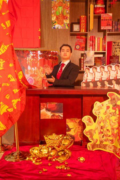
Xia Cheng’an in ‘Wealth Art’
“The very words’ taste’ and ‘aesthetics’ annoy me. They are full of arrogance and prejudice,” he says. “I wanted to use trashy and lowbrow visual language to destroy tidy, beautiful, ‘professional’ design and irritate people who think design is about taste and aesthetics — this is the starting point of my practice.”
Xia follows the ‘more is more’ aesthetic in a positively disorientating way, producing work that is far more exhilarating and dazzling than it is visually pleasing. In fact, pleasing would be the least suitable term to describe it — even browsing through his website is a headache-inducing experience.
Xia’s color scheme is composed of saturated tones, mostly bright red and golden yellow, representing China in all its glory. He uses a myriad of colliding symbols mixed with brazen typography, all delivered in an utterly cluttered layout that leaves you overwhelmed, even dizzy, wanting to rest your eyes after a minute or so.
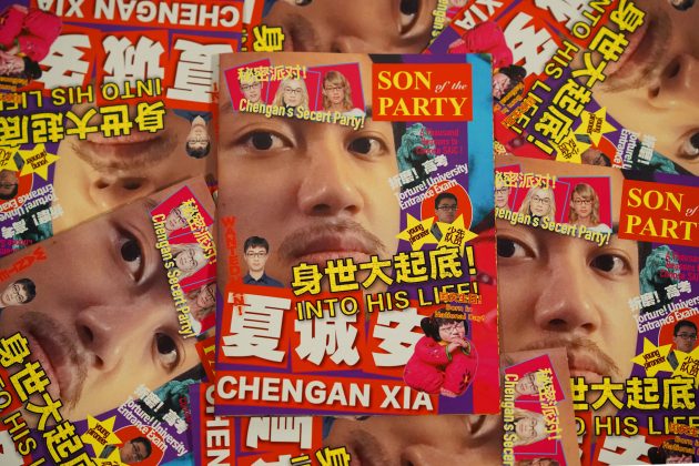
Xia Cheng’an’s ‘Son of the Party’
Born in 1995, Xia spent most of his life in Shanghai. After graduating with a bachelor’s degree in graphic design from East China Normal University, he moved to Chicago for an MFA in visual communication at the School of the Art Institute of Chicago.
However, what he learned about design as a student often contrasted with his personal interpretation of the design world around him, especially on the streets of Shanghai.
Xia was always drawn to the look of posters and banners he saw on the facades of shops and grocery stores. To him, they were strong, direct, and functional, in line with modern views of what good design should be.
Still, it bothered him that most of his classmates and professors didn’t share his point of view — they thought said posters were ugly and unsophisticated. Their blatant criticism made him wonder if design, as a practice, “had been twisted into a strange standard of high taste or upper aesthetics in China,” he says.
Around 2017, the works of Japanese graphic designer Yui Takada made the rounds in design circles. Takada is one of the most prominent representatives of a new movement that challenged traditional aesthetics: Ugly design.
“It blew my mind,” Xia recalls. “It made me realize I could make graphic designs based on the terrible banners and signboards I saw every day in the streets of Shanghai. I didn’t need to follow the ‘less is more’ rule set by modernist designers who were way too far from my life.”
Xia is a consumer of lowbrow aesthetics. He’s an avid buyer of Chinese plastic souvenirs he finds in Chicago’s Chinatown, the shops near Yu Garden in Shanghai, and, of course, on Taobao. Along with Shanghai’s shop signs, all these vernacular, untrained, try-hard designs form an unlimited body of reference for his work.
Ugly design, however, in the way most designers were practicing it, did not satisfy him. It was simply not as provocative or eye-catching as he wished.
“Designers tend to moderate the raw and bold quality of the visual materials by using techniques such as tracing images, flattening shadings, and desaturating colors,” Xia explains.
“I decided to abandon such moderation and amplify the wild aesthetic to its extreme.”
The more Xia investigated his references, the more fascinated he became.
“I realized that this aesthetic is very rich. We can decompose it into many cultural topics related to contemporary social and historical issues. That’s why I decided to move my practice from simple visual appropriation to a proper cultural study of the Chinese social phenomena,” he says.
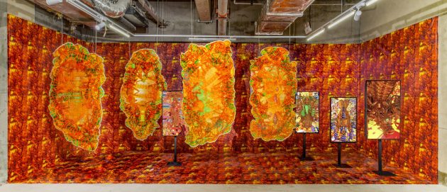
Hanging lenticular boards resembling insect cocoons at the ‘Ch’iung Lien’ installation
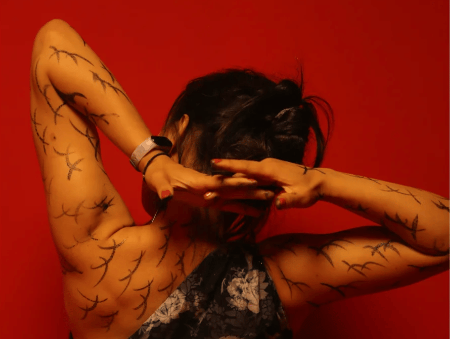
In the installation ‘Ch’iung Lien: the forgotten origin of Chinese cultural symbols,’ Xia digs deeper into the history of the souvenirs and products he likes to buy.
He relies on Eric Hobsbawm’s theory of ‘invented tradition,’ which claims that, often, traditions and symbols that are accepted by most as old are, in fact, relatively new and were invented, or at least re-contextualized, to forge a sentiment of identity and continuity with the past.
Xia was surprised to learn that some ancient Chinese symbols served the same purpose and were reinvented in the 20th century.
This slideshow requires JavaScript.
The installation is composed of digital images and hanging lenticular boards, the latter looking like insect cocoons (see gallery above). Xia uses the image of the Galloisiana sinensis, an endangered insect found in Northeast China, to express the idea that symbols such as dragons, Buddha statues, and lanterns can also be reinvented.
In his fantasy, the Galloisiana sinensis crossbreeds with these objects to create new traditional symbols.
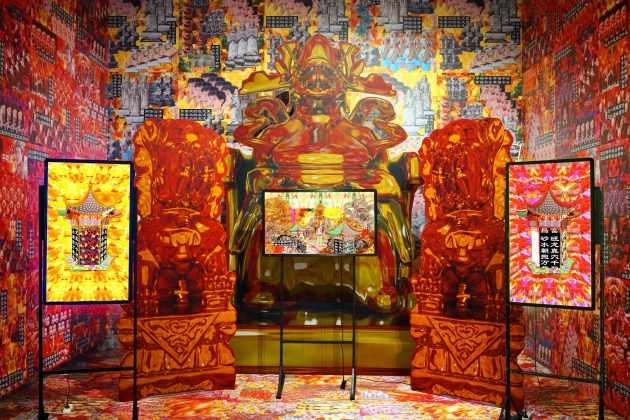
Another installation by Xia Cheng’an, titled ‘With silver, With gold’
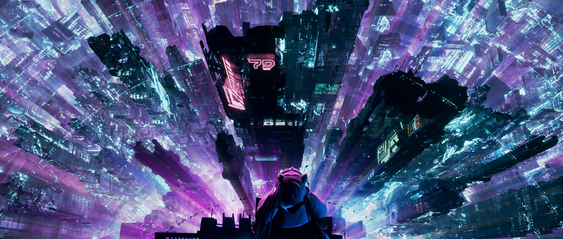
Still on the theme of tradition, the mesmerizing ‘With silver, With gold, Bridal sedan chair to the door’ criticizes Chinese authorities’ banning of specific practices, such as burning funeral rituals. The installation also raises the question of whether there are any boundaries between reality and virtual, body and spirit.
The installation includes an almost 10-minute video, purposefully glitched, that combines traditional elements with pop culture images and consumerist symbols. Meanwhile, the soundtrack comprises a hypnotic loop of the Great Compassion Mantra mixed with Huangmei opera.
The Galloisiana sinensis from the previous series also makes a cameo in ‘With silver, With gold,’ metamorphosing into a golden Buddha statue.
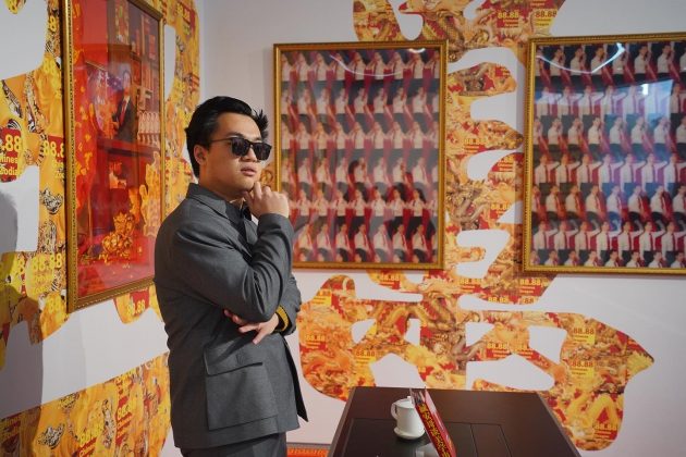
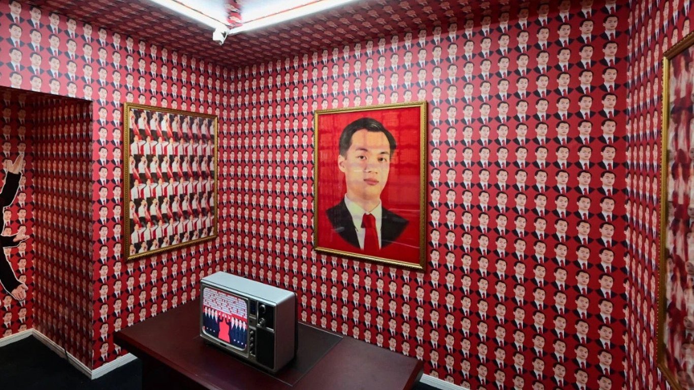
The ‘Wealth Art’ installation sees Xia Cheng’an use role-playing to portray ‘Aesthetics Master Xia’
Xia also refers to ideological emblems in his work. In ‘Wealth Art’ and ‘Aesthetic Career,’ both hybrids of installation, photography, and performance featuring himself, he reclaims elements of communist aesthetics, such as portraits, slogans, and the prominence of the color red.
His goal is to show how the communist mindset still lingers in many sectors of Chinese society today, despite the radical changes the country has been through in the past three decades.
Xia has never worked for any Chinese companies, so he was shocked to discover how Chinese firms commonly use aspects of military training and the cult of personality to indoctrinate employees.
This realization led to the birth of a fictional character based on his own image: Master Xia, a captain of the arts, amusingly and ironically enlightens young artists on becoming more prosperous. In a series of mockup textbooks, Xia scribed baseless, invented art-making theories inspired by line production procedures. The texts glorify Master Xia and his brilliancy, naturally.
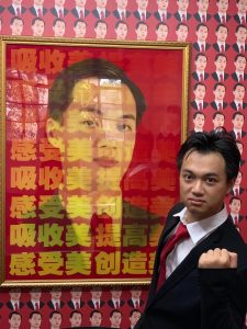
Xia Cheng’an’s ‘Aesthetic Career’
Whatever Chinese netizens create online also intrigues Xia. He’s especially drawn to what he sees on Kuaishou, a social video platform that’s particularly popular in third-tier cities and rural areas.
In the series ‘Laser Rain,’ which can also be viewed as a web version, he draws inspiration from the tuwei videos that have come to characterize Kuaishou content.
For the uninitiated, tuwei videos are typically shot on cheap mobile phones, are of shoddy quality, and see overuse of poorly designed filters and effects. As a result, the term has come to describe lowbrow, unfashionable tastes associated with rural life in China.
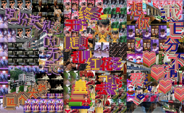
‘Laser Rain’ is informed by the tuwei aesthetics often associated with poor taste in rural China
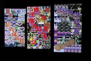
Xia Cheng’an’s ‘Laser Rain’
Xia is fascinated by how tuwei videos often appropriate mainstream and urban culture by reproducing scenes from gangster or martial arts movies and TV dramas.
Hence the mesh of pop clips, countryside images, and looping visual effects in his self-starred ‘Laser Rain.’ Strident Chinese pop songs make up the soundtrack to intensify the stimuli.
“I tried to summarize tuwei aesthetics as a misplacement of ‘city content’ under a ‘rural context.’ This can only happen in the social media era,” observes Xia.
He also notes that the same tuwei aesthetic that dysfunctionally appropriates city culture has now been reintroduced into the city as a new subculture. “From this perspective, I found it interesting to compare tuwei with other grassroots cultures such as punk and hip hop,” he says.
Even though Xia dives deep into his research, he doesn’t wish for his art to be didactic. He always aims for a level of ambiguity to increase the visual and emotional impact his works have on his audience, who have diverse backgrounds.
“I feel like most Western audiences are visually shocked by my work.”
When reflecting on how people perceived his art in Chicago, he says, “Since the images were too far from their life experiences, it was hard for them to respond more strongly.”
At home in China, however, he commonly receives deep and meaningful feedback, which makes him believe that he has captured the essence of contemporary China.
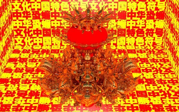
Yet another eyeball-inflating work of art from the ‘Ch’iung Lien’ installation
Still, Xia thinks that International audiences can appreciate Chinese maximalism. They have already shown they’re open to trends such as ‘Gangnam Style’ and films like Crazy Rich Asians.
Even fashion brands have attempted to ‘go local’ and to ‘go maximum,’ as with Balenciaga’s controversial Valentine’s Day campaign, which also took inspiration from tuwei, but was horribly received. Xia points out that a more profound understanding of Chinese culture is necessary to avoid similar mistakes and offensive stereotyping.
As for himself, he will always strive to show the complexities of contemporary China, especially on the international stage. The social phenomena he analyses with his work is, above all, “the fetishism of power; both the power of capital and the power of the nation.”
He adds that it stems from the “rapid capitalization of China that left no space for the development of new value systems.”
In a playful, unconventional style, Xia’s work portrays the Chinese paradox of tradition versus modernity, communism versus consumerism, and rural versus urban. In real life, as in his art, everything clashes together in a confusing and dissonant way.
What’s more, Xia believes that it isn’t just fine art but graphic design, too, that can confront defective systems and question the status quo.
He points out that his generation of designers no longer conforms to traditional concepts and commercial needs: “Their works have strong characteristics that defy the commercial system, speak of social needs, and even create new trends and markets. It seems like the boundaries between designers, artists, and activists have become thinner and thinner — this is an absolutely positive trend for visual workers.”
Additional reporting by Lucas Tinoco
All images courtesy of Xia Cheng’an

