
New York-based artist Wu Qingyu describes herself as a “graphic designer and krautrock lover,” and while she has a number of impressive projects under her belt that are purely about design, it’s hard to separate the music side of her identity from her work overall.
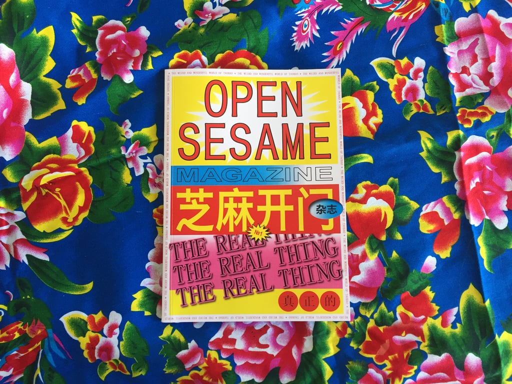
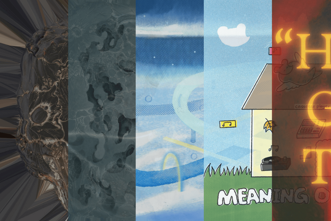
I first encountered her elegant approach to blending Latin and Chinese typography in the album design for The Landscape the Tropics Never Had, the third album by Beijing band Chui Wan, released last September. More recently, Wu put her spin on the visual identity of recently launched experimental composition label Maybe Noise, designing an appropriately bold, minimalistic sleeve design for its first release, Píng Zè:

Wu describes her aesthetic for Maybe Noise as “organized chaos as contrasting fonts”
Originally from Changsha in central China, Wu moved to the US for university, and received her MFA at the Cranbrook Academy of Art in Michigan last year. The work she produced while a student sprawls across different media and design traditions, combining influences from Western, Chinese and Japanese sources with an interest in exploring cultural and historical topics — everything from ping pong to the Cultural Revolution — via her unique aesthetic concerns.
Since graduating, Wu has lived in New York — “the city offers equal parts access, inspiration and opportunity” — but she’s kept up a dialogue with kindred creative spirits back home in China for her music-related freelance work. I caught up with her to talk about her background in design, and her approach to bridging cultural and language barriers with her work.

RADII: You’re from Changsha, right? How did you first get started as a designer? Did your parents support you in this, and did you have access to resources to study design in Changsha?
Wu Qingyu: Yes, born and raised. I think there are many things that you don’t realize until you get to a certain age. Looking back, I feel like I got started as a “designer” or started getting interested in design when I was in elementary school, hand-lettering and creating bilingual typography on book covers for each semester’s textbooks. In certain ways, it’s all linked back.
I always feel grateful and lucky because my parents are very supportive, enlightened, and liberal. They are very industrious in pursuing their dreams. My dad was a city planner and florist. My mother has run her own business in fashion for over 20 years. They both love arts and culture, and sent me to study drawing and painting when I was very young. At that time, there weren’t many places to study design in Changsha, but I discovered various design between a local bookshop called DingWangTai (定王台) and the Hunan Library. On the second floor of DingWangTai, there are few “secret” shops hidden in the corner, you can always find a lot of imported magazines, design books, and beautiful photo books. I spent most of my allowance on back issues, and I was reading COLORS Magazine, Vogue, The Outlook Magazine (新视线), Milk, Art and Design (艺术与设计), etc. It was very influential, I think. It was a good way to escape a small city and all of its fickle entertainments.

Art book for Liu Dandan (designed by Wu Qingyu)
Besides those magazines, what were some important Chinese influences on your design sensibility when you were first starting out? Foreign influences?
After high school, I decided to study abroad in the US, and received my BFA in Graphic Design from Virginia Commonwealth University and an MFA in 2D Design from Cranbrook Academy of Art. My work truly came into being and flourished there. So most of my important influences are my college professors, mentors and colleagues, and some European designers and a few Japanese designers as well.
I remember I watched a British biopic called Control during high school, it’s about the life of Ian Curtis from Joy Division. After that I became a big fan of Peter Saville’s design, he did many wonderful record sleeves for Factory Records, and was also involved in fashion — he collaborated with many amazing fashion designers like Jil Sander, Raf Simons, Yohji Yamamoto. He is always my inspiration.


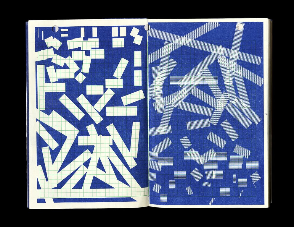
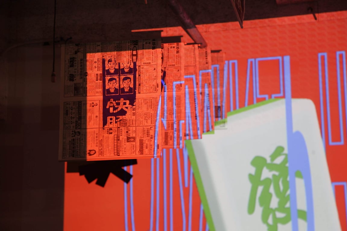
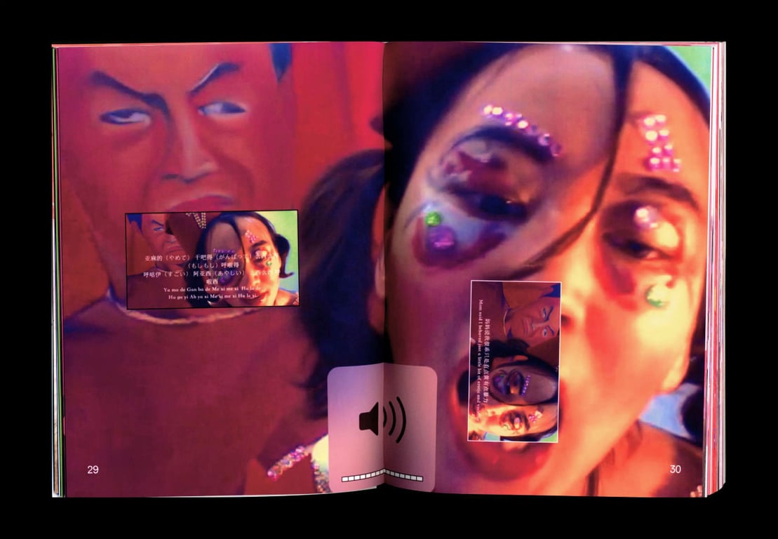
Much of your work is concerned with materiality, such as your book The Item You Selected Is Unavailable, which takes everyday objects and transforms them into collaged, grid-like abstractions. What are some of the objects you used as source material, and what about these objects in particular attracted you?
Yes, I find that I have a strong interest in objects — everyday objects, obscure things. I’m also interested in the idea of data, space, and repetition: points, grids, lines, numbers, and symbols in an endless search for collecting pieces of information.
In this work, I translated a group of found objects — including abandoned 7″ vinyl records, funnels, vintage filmstrips, ear picks, tobacco tin boxes, soap, dice, and other miscellaneous items collected from thrift stores — into graphic form to create the book The Item You Selected Is Unavailable. I randomly overlapped some of the forms taken from each object by using red and blue Riso colors. Each form resembles an object I have collected from the past, and each abstract shape is made from the measurement data of the object itself.
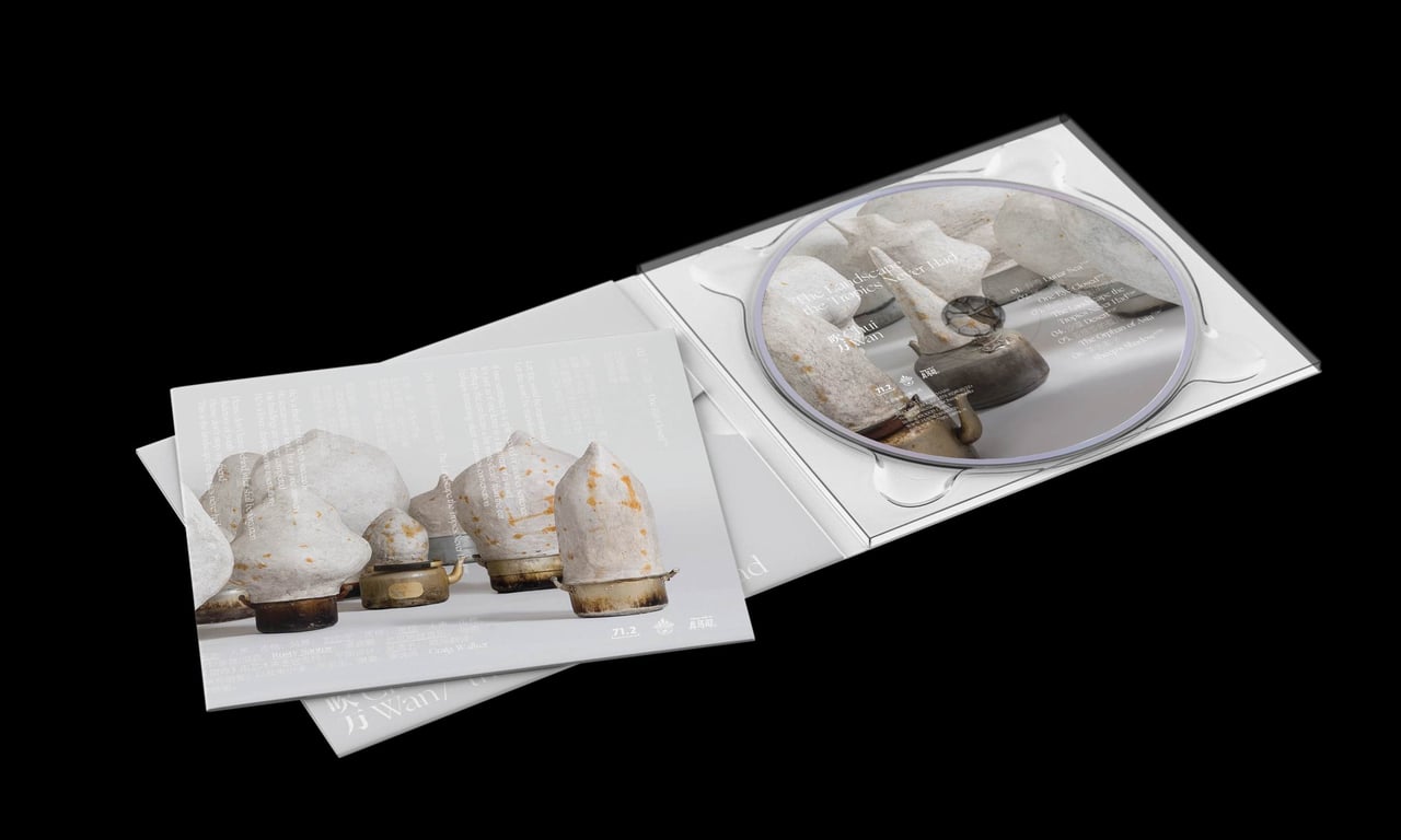
Album art design for Beijing band Chui Wan’s third album, The Landscape the Tropics Never Had
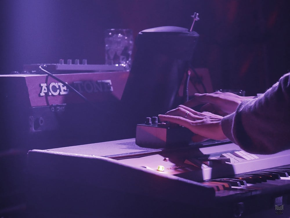
You describe yourself as a “krautrock lover,” and you’ve been working in recent years with a certain set of experimental musicians in China, including the band Chui Wan and the label Maybe Noise. How did you first get into this kind of music? How did you connect with these Chinese artists?
Firstly, it has been an amazing and unforgettable experience to have a chance to work with Chui Wan [and their label] Maybe Mars, as well as Maybe Noise.
I got into krautrock the first time I heard the songs “Das Model” and “Radio-Aktivität” by Kraftwerk, which was almost ten years ago. Though the songs were produced in the late ’70s, they made me feel that was the sound of the future. I got obsessed with the oddly physical music of Kraftwerk and their album design, as well as most of their music videos. Then, I started to listen all related bands from that period, such as Neu!, Can, Popol Vuh, Brian Eno, and Faust. In 2010, I was fortunate to watch an incredible BBC documentary that charts the rise of synth pop from suburban England to the world’s dance floors. That documentary — Synth Britannia — unlocked many other dramatic musicians to me.
Related:
My friends and I always like to share music with each other. Four years ago, one of my good friends introduced Chui Wan’s songs “Seven Chances” and “Vision” to me, I was deeply impressed with the musical style and it immediately reminded me of Neu! and Can in a very unique way. I think it’s so rare and exciting to hear this kind of music come out of China. I started to follow them on social media, and looked for an opportunity to collaborate with artists like them.
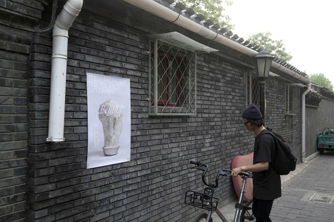
Chui Wan 2017 tour poster hanging in a Beijing hutong
For Chui Wan’s latest album, your design incorporated the work of Dali-based sculptor Li Gang, and also responded to what you’ve called the band’s “ambiguous, poetic, and textural melodies.” How does your typographical work respond to or interact with these two other elements?
The idea or goal of this album design is to express and expand the musical enjoyment, or the spirit, emotion and inspiration that the music itself brings to the audience (and me). I wanted the design to be unique and leave an imaginative space, just like their music.
I was very excited when I learned that this album needed a bilingual identity. I always find unexpected, magic moments when working between two totally different language and writing systems. Sometimes they can look awkward together or feel forced, but sometimes they can be extremely fascinating and beautiful.
[pull_quote id=”1″]
Chinese and Latin fonts are traditionally written with different instruments, and the character structures are also very different. When trying to connect these two, [it’s important] not only to integrate the content and form of different styles or personalities into the same system, but it’s also important to create the right mood, feeling, and atmosphere around it. Like the relationship of yin and yang in Chinese philosophy, how seemingly opposite or contrary forces may actually be complementary, interconnected, and interdependent.
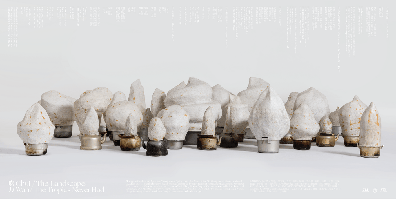
In Li Gang’s work, you can find a wild mix of the materials he uses — such as plaster, hair, rebar, and discarded kettles — and they are combined in a very dialectical way. The work possesses the rare ability to combine the universal and the specific, the intimate and the distant. Very similar to Chui Wan’s music, it is a kind of atomization of “reality.” I think there is a strong common significance and philosophy connecting Chui Wan’s music, Li Gang’s work, and my design approach. The composition of temperament is so close.
—
Find more of Wu Qingyu’s work at qingyuwu.com
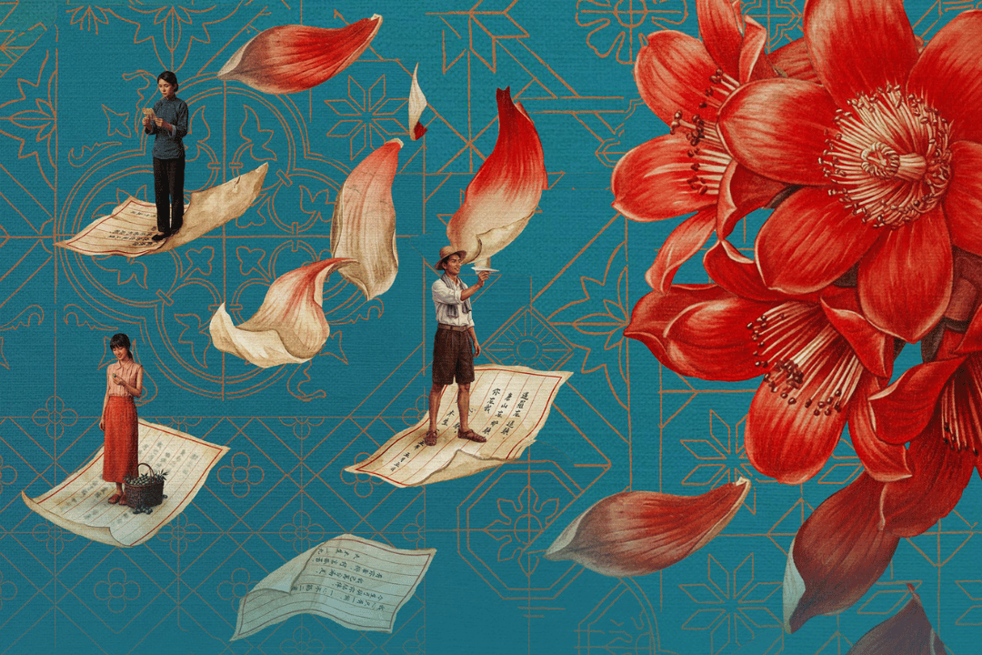
Cover image: Second Year Review at Cranbrook Academy of Art
You might also like: