
Editor’s note: This article by Jason Li was originally published on 88 Bar, and has been re-posted here with permission.
Hong Kong-based typographer Julius Hui has recently started an Instagram account dedicated to Chinese type design with insightful and incisive bilingual commentary. Below we’ve captured some of our favorites:
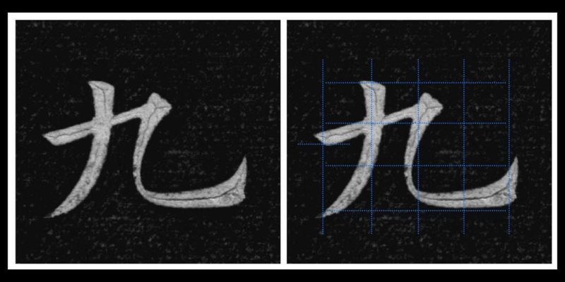
Inspiration_Calligraphers in Qing dynasty are usually not recommended by scholars, they are always being criticised as ‘too rigid’ and ‘too robotic’. But what I saw is, it’s a period of breaking into modern world. It is a writing of Qing’s calligrapher Yao Mengqi, how the character ‘九’ being written under a well definitely underlying grid. This is important insight for late comer to learn from.
Works_Logotype designed for Hong Kong illustrator Don Mak. Don specified the design should reference from Mr Au Kin Kung’s Beiwei Kaishu calligraphy. The terminal of strokes are smart and strong, making a strong impression and good for shop signs.

Works_deliveroo’s Chinese logotype. The Chinese counterpart referenced from English logotype’s reversed contrast feature, having a heavier horizontal strokes and thinned vertical strokes, an opposite way to the tradition. All the turning angles are relevant to its English counterpart, while the 「⻍」radical, an unique part of Chinese, was designed to have a slick and flying-like visual experience, implicates a smooth and happy food delivery.
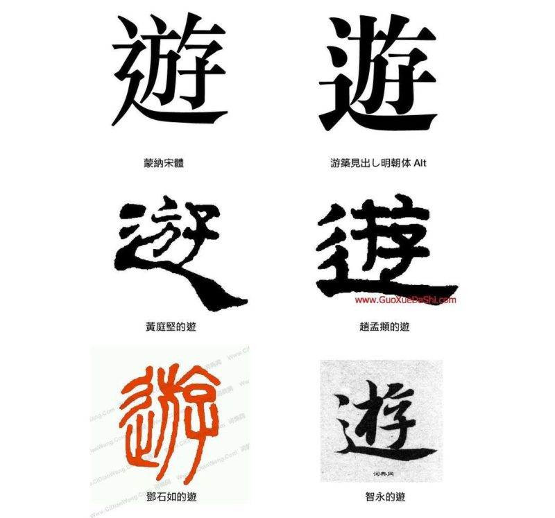
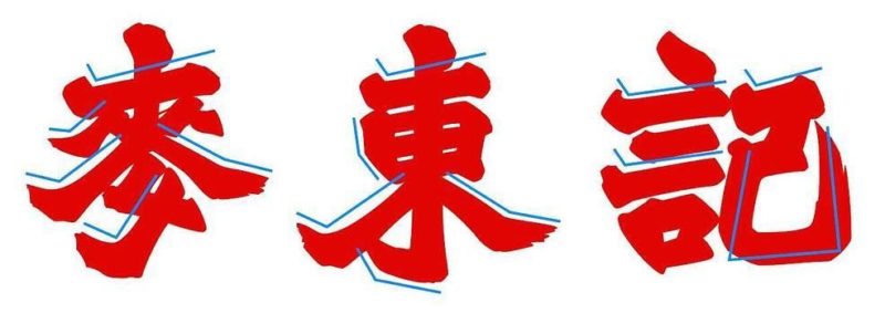
Knowledge_So, how should ‘辶’ look like? According to modern order, the one with 2 zigzag that came from Tang Dynasty is the ‘correct’ letterform. For the writing comes with 2 dots, we shouldn’t claim it as a ‘wrong’. I remember when I first introduce the legacy stroke order, someone claim it as ‘wrong’ with no brainer, some even claim it’s wrong writing from Japan. But when Hanzi alive in the last 2,000 years, it reflects how stupid we are if easily defining black & white here. ‘辵’ with 2 zigzag, was first defined in Tang dynasty, and adopted by emperor later in Song dynasty.
But the one comes with 2 dots, could be seen as early as in Qin and Han dynasty, as part of seal script, and later could be in clerical script as well. There are many legendary calligraphers in the history writing in such order.
Government defines stroke order, is for the reason of common communication protocol in modern way. We as usual people, as soon part of the river of history, our destiny is to help our civilisation grows, rather than stop from our generation.
—
Follow Julius Hui on Instagram
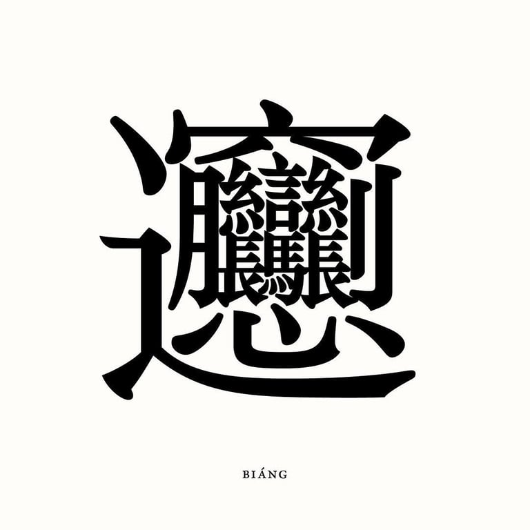
Cover image: “Aero Ming_had a great treat in Xi’an, couldn’t forget the great taste of biáng biáng noodles. It maybe the most beautiful biáng character in the world, as it seems no one would spend much time on it.” – @juliushui_typography
You might also like: